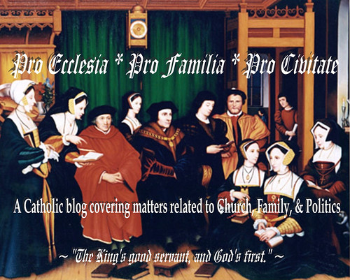
Which Masthead Image Do You Prefer ...
... the "textured" version (giving the image a more grainy look), or the "non-textured" one?
As you can see, I've been doing some tinkering with the image to try to give it a little more professional look than I had with the literally pasted-up image I used to have in the masthead.
I am open to additional suggestions for how to spruce up the masthead image.
UPDATE
So far, the vote tally is 7 votes to 1 in favor of the "clean" masthead image over the "textured" one. I'm leaning toward the "clean" image myself. But, if you haven't yet expressed an opinion, there's still time to get your 2 cents worth in (and yes, someone actually offered their 2 cents).
Labels: Blogging


12 Comments:
I prefer the non-textured. While the textured gives an antique quality, I prefer to clean look.
I agree with robk, Jay. The non-textured is my preference. I like the new "hymnal" lettering. Groovy!
Make that three.
Make it four.
Non-textured. Next thing you know you're going to infuse your more theological posts with 'nuance.' ;-)
My two cents.
;)
I guess I can't help being contrary: I like the textured look. I would lose the beveling, though (but keep the text!).
I like the clean one, too.
FWIW, I prefer the non-textured and like Publius am not fond of the beveling. However, I think there is room for doing something different about the edges. I suspect that going with the standard issue feathered edge would work well. You know, just feathering the image into the existing background color. You might want to try it and see how that looks.
By "beveling" are you guys referring to the shadow effect around the text? Or is that in reference to the edging around the image?
As for feathering the image into the existing background color, I have no idea how to do that. Not technologically savvy. Remember, up until 2 days ago, the image I was using had text that was literally pasted onto the picture.
It was only a couple of nights ago that I remembered the publishing software that came with the computer I purchased over 5 years ago.
By "beveling" I was referring to the white edging. I like the text the way it is.
Okay, thanks. I knew it had to be one of the two things, as those were the only "special effect" I added.
Post a Comment
<< Home